Adventures in negative space
Font is more than a utilitarian tool at Cal Poly's Shakespeare Press Museum
By Ashley Schwellenbach[{
"name": "Ad - Medium Rectangle CC01 - 300x250",
"id": "AdMediumRectangleCC01300x250",
"class": "inlineCenter",
"insertPoint": "8",
"component": "2963441",
"requiredCountToDisplay": "12"
},{
"name": "Ad - Medium Rectangle LC01 - 300x250",
"id": "AdMediumRectangleCC01300x250",
"class": "inlineCenter",
"insertPoint": "18",
"component": "2963441",
"requiredCountToDisplay": "22"
},{
"name": "Ad - Medium Rectangle LC09 - 300x250",
"id": "AdMediumRectangleLC09300x250",
"class": "inlineCenter",
"insertPoint": "28",
"component": "3252660",
"requiredCountToDisplay": "32"
}]

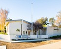
In the basement of Cal Poly’s Graphic Arts Building (number 26 for those who prefer integers to words, though this is very much a story about words) reside cases upon cases of type punctuated by huge wooden drawers with metal handles that heft outward to display their treasures. Antique presses, numbering more than a dozen and dating as far back as the 1850s, carry on with the preoccupations of all geriatrics beneath the fluorescent lights. Shelved cans of viscid ink grow a single layer of skin over time. And the single clock does not bother to tell the actual time.
In short, the Shakespeare Press Museum is a space full of old things, and simultaneously ageless. Every few years a new student curator assumes responsibility for the venue and its equipment. This year the title belongs to Alix Guyot, a fourth-year graphic-communications student who assumed the role after the majority of the students affiliated with the Friends of the Shakespeare Press Museum graduated last year. Laura Sorvetti, a graduate student of history, serves as assistant curator. Both have developed strong left arms from cranking levers on the vintage printers. The third face affiliated with the museum, though one that appears here much less frequently, is that of Brian Lawler, faculty advisor and professor within the graphic-communications department.
As a student, Lawler was involved with the Shakespeare Press Museum when it first opened to the public in 1969. The university acquired the equipment between 1950 and 1964, from the private collection of Charles Palmer, whom friends referred to as Shakespeare. Lawler would remain an active figure at the museum through 1974, serving as student curator in 1971. Officially, the group is classified as an ira—instructional related activity—although it was once formally considered a club. But the group’s status on campus, while not insignificant, pales in comparison with the message it advertises: the importance of print.
“The art of printing diffuses so general a light, augmenting with the growing day, and of so penetrating a nature, that all of the window shutters, which despotism and priest craft can oppose to keep it out, prove insufficient,” reads a sign on the museum exterior, quoting Benjamin Franklin in Caslon type.
Guyot and Sorvetti circulate among the machinery—a Campbell country cylinder press (1890), an Edison mimeograph (1902), a Palmer and Rey platen press (late 1880s), an Aragon paper cutter (1881) among many others—like high priestesses, performing rites and executing tasks incomprehensible to most guests.
“I wouldn’t say this was very instinctive to pick up because I can’t think of anything you do that’s similar to this,” explained Guyot, donning a blue apron emblazoned with the name Shakespeare Press Museum. “If you want to get really good at it, that takes time and patience.”
“We’re younger people who are trying to figure out how to do this. It’s kind of a lost art,” added Sorvetti. “We can look at old books but the way we’re trying to learn it is kind of piecemeal. We can’t take a class.”
In fact, at one point the Friends of the Shakespeare Press Museum were asked to teach a class about letterpress printing, a charge that Guyot and Sorvetti did not feel sufficiently prepared to meet. Their primary purpose, despite dedicating a significant chunk of time to creating greeting cards that they then sell on etsy.com, is to care for and share the equipment with the public. The museum may conspicuously lack velvet ropes, but its function remains the same.
The hours that the museum is open to the public shift from quarter to quarter, depending upon the curator’s and assistant curator’s schedules, but students and community members alike are welcome to view, and operate, the equipment. In fact, the group welcomes people to utilize the equipment for their own projects, provided they bring their own paper. Guyot and Sorvetti even offer instruction.
There are many terms for a novice print setter to learn, perhaps the most basic being that glyphs and numerals (letters and numbers) are placed within a California job case (the term for the frame that lines of lettering are locked into). Some types are made from wood, others from lead. Lead is soft and easy to damage. Wood type is difficult to make, but once the type gets above a certain size the lead becomes too heavy. As a frame of reference, a font that is one inch tall is 72 point. Serifs are flairs at the end of glyphs, ornamental wings and curls that gather at a letter’s edge. (Hence the term sans-serif, which refers to font without this decorative element.)
While any contemporary schoolchild can discern the difference between an upper-case and a lower-case alphabet, few adults would be likely to cite the fact that, when setting type, upper-case letters were literally placed in an upper case, while lower-case glyphs were placed below. The lexicon that belongs to this world, which sometimes seems to hover at the brink of extinction, has been appropriated in relation to computers and documents, though on a very small scale.
“There is something of a language that develops down here,” said Guyot. “You learn it as you go along. Or you don’t and you call it a thingie ma bob.”
In an economy in which no one seems to have enough, the museum is an anomaly. Letterpress printing is an economical endeavor; besides ink and paper, the press’s faithful consume very few resources. Paper is often donated by the community while cans of ink are provided by Cal Poly, and can last for decades. Guyot is interested in purchasing metallic ink for special holiday cards, but even metallic ink is not a particularly dear expense. Occasionally the organization will spring for a new font, commissioned from a foundry. But some costs, such as flying in an expert on letterpress machinery from Chicago to fix several of the presses, are unrealistic. Guyot, Sorvetti, and Lawler don’t have the necessary engineering know-how to mend the equipment, but difficulties rarely arise anyway; like the Shire, letterpresses were made to endure.
Besides peddling assorted holiday and greeting cards on etsy (under the seller name shakespearepress), the museum has recently acquired an additional income source. Several years ago, Lawler requested funding for software that would enable him to digitize and improve individual types. It’s a project that Lawler had wanted to undertake for some time, but one that was sufficiently time-consuming to deter him. The process is long; he has one font that he has been working on for 10 months, but it might soon pay off.

Lawler begins by selecting a font that he finds interesting, running it against a database of known fonts. If someone else has already drawn a font, he has no business re-creating it. Many are so rare that they don’t have a name.
After selecting a font, he uses Adobe Illustrator to re-draw each letter, modernizing them slightly in the process and building a library of serifs particular to that font. Sometimes the type is slightly damaged, or a serif is inconsistent, but Lawler must always remember to maintain the spirit of the original when correcting it. Other fonts are simply incomplete, as was the case with Becker, which had both upper and lower case glyphs as well as numerals but no punctuation marks.
“When you’re finished there are 240 characters in a type font. You can’t issue a font that doesn’t have a yen symbol,” Lawler insisted. “I drew a beautiful yen yesterday. This morning I drew the dollar sign, the cent sign, the plus or minus, the divided-by.”
After that there is still the exacting task of kerning: negotiating the white space between letters, numbers, and symbols. These adjustments must be made within thousandths of an em (a typographical unit of measurement) and must take into account the possibility that any capital letter could potentially be followed by any other capital letter, however unlikely a combination. Z, for example, would rarely be followed by an M, or P, but that fact does not allow Lawler to simply skip kerning for these two letters. Some fonts are dutiful, and the glyphs naturally adjust themselves.
After these adventures in negative space are at an end, Lawler tests his work, listening to NPR and typing the report with his nearly polished new font. He returns to the favored typographer’s pangram, “The quick brown fox jumps over the lazy dog,” as well. He makes posters and stares at them for weeks and weeks until he finds an error in the font.
“If this sounds obscure and esoteric and arcane, all three are true,” acknowledged Lawler, who hasn’t yet identified any financial incentive for the hundreds of hours he has invested in the project. “From a sociological perspective and a technological perspective and an artistic perspective it’s a fabulous thing to do. I’m contributing to the well-being of the museum and the industry. But it’s a thankless thing to do.” Like music, fonts are frequently appropriated without purchase. Many people don’t even realize that they’re intellectual property that someone has invested time creating.
“Most people never pay for fonts in their entire lifetime,” lamented Lawler. “I’m proud to say that every font in my library is legally purchased. I have bought thousands of dollars worth of type fonts.”
Soon, anyone who purchases their fonts legally may be able to own some of the museum’s more obscure fonts, due mostly to a series of fortuitous but random events. While Lawler was at the Newberry Library in Chicago last October—researching fonts, of course—a stranger approached him. The president of a company that sells type, he had recognized Lawler’s name at the sign-in desk and searched the library for him, wanting to express his appreciation for Lawler’s scholarship. The professor was quick to recognize the possibilities behind a chance encounter between a font vendor and a professor in possession of rare fonts.
In December the vendor again contacted Lawler, who sent him a sample of the fonts he had been working with. Then, in January Lawler received the news that he was willing to sell the museum’s fonts, a significant coup.

In order to understand Lawler’s sacrifice of time, one must first appreciate his passion for font. Some fonts make his heart go pitter-patter. Each has a kind of calling, a purpose for which it is uniquely suited. Some fonts are purely utilitarian and belong on signs that direct passersby to the nearest bus, restroom, or subway. Others elegantly issue an invitation or bestow an honor or title. As far as Lawler is concerned, Johannes Gutenberg is the most important person who has ever lived—“deities notwithstanding,” he adds, for the sake of deflecting outrage.
But he’s not alone, however esoteric the field of typography may seem. After all, each year the Friends of the Shakespeare Press Museum is reinvigorated with new blood, even if it is in small quantities. There is always room for more bodies, of course, in the hallowed, fluorescent-lit space. Volunteers are scarce and Guyot and Sorvetti face a near-insurmountable task simply organizing and putting away more than 500 sets of type. Before those pesky child labor laws were enacted, printers would employ children (called printer’s devils) to put away the type—a task, Lawler insists, that no one in the history of typography has enjoyed.
However tedious the process of putting away type may be, and however little money there is to be had in creating new types, the museum has endured for 40 years, and somehow always manages to secure a handful of devotees. Weekly they descend into room 116, with its spotty cell phone reception, emerging hours later, blinking, with ink-stained hands. But they also materialize with a sense of investment and ownership of their work, a pride and pleasure that modern technology and bargain bins in bookstores cannot erase.
“What we print, how we print, the colors, each font has meaning—it’s an art,” said Guyot. “And it should be respected.”
Arts Editor Ashley Schwellenbach wants a type named after her. Send samples to [email protected].
Latest in News
-
Controversy erupts in Arroyo Grande, again, over City Hall Pride flag
Apr 25, 2024 -

Two residents sued Atascadero for flood damage, increasing the list of storm-related lawsuits in SLO County
Apr 25, 2024 -
Student journalist sues Cal Poly for California Public Records Act violation
Apr 25, 2024 - More »
Readers also liked…
-
Coast Unified teachers upset over new position's salary and qualifications
Oct 20, 2022 -
SLO police identify alleged driver who hit and killed couple
Dec 22, 2022 -
When the levee breaks: Oceano residents, county officials walk a tightrope of regulations to manage Arroyo Grande Creek, which some say led to the levee's failure in January
May 18, 2023
More by Ashley Schwellenbach

