[{
    "name": "Ad - Medium Rectangle CC01 - 300x250",
    "id": "AdMediumRectangleCC01300x250",
    "class": "inlineCenter",
    "insertPoint": "8",
    "component": "2963441",
    "requiredCountToDisplay": "12"
    },{
    "name": "Ad - Medium Rectangle LC01 - 300x250",
    "id": "AdMediumRectangleCC01300x250",
    "class": "inlineCenter",
    "insertPoint": "18",
    "component": "2963441",
    "requiredCountToDisplay": "22"
    },{
    "name": "Ad - Medium Rectangle LC09 - 300x250",
    "id": "AdMediumRectangleLC09300x250",
    "class": "inlineCenter",
    "insertPoint": "28",
    "component": "3252660",
    "requiredCountToDisplay": "32"
    }]
All wine labels share one common purpose: They’re trying to sell wine. But the art of creating an effective wine label goes far beyond simple marketing. Wine labels can tell a story, communicate ideas, and create brand recognition that turn wine drinkers into loyal customers.
About 330 million cases of wine are sold annually in the U.S., and every one of those bottles has a label on it. Someone somewhere designed each and every one of those labels. What thoughts went into it? What was the designer trying to communicate? And did it work?
The next time you walk down the wine aisle of the grocery store, take a look at the labels. Which ones stand out? Which ones draw you in? Labels have just a second or so to get your attention, but that second of your attention may have been months in the making for a label designer.
Stand out
Makers & Allies is a San Luis Obispo design firm that focuses almost exclusively on alcohol packaging.
“We say we’re a brand and story boutique specializing in wine, craft, and spirits,” explained co-owner Sarah Berger, who along with her fiancé, Garrett Deiter, operate the design studio and oversee their four employees and two consultants.
They have a fairly simple design credo. “Stand out,” and remember that surprise is key to standing out. “Stand for something,” and inspire greatness. “Details are everything,” and make craft brands into icons.

Berger is a Cal Poly painting and drawing graduate from the College of Art and Design, who in the course of her studies learned about graphic design. When she graduated, she saw design as a practical way to use her artistic skills.
“It was a way for me to be creative but also to help people,” she said.
Her company’s designs have won awards and have been featured in wine label stories in publications ranging from Wine Enthusiast to Forbes. In addition to designing labels, they’ve also designed interiors for tasting rooms at wineries such as Tooth & Nail, Foremost, Grey Wolf, and Ancient Peaks.
“We try to work with people who care about their product,” Berger said. “People put their heart and soul into what’s inside the bottle, so we try to do the same thing for outside the bottle.”
Field Recordings
Makers & Allies also seems to be trying to erase wine’s elitist reputation. One of their recent projects was wine in a can.

Yes, it’s a thing.
Winemaker Andrew Jones at Field Recordings in Paso is selling Alloy Wine Works Central Coast Grenache Rosé, which comes in a tall, silver aluminum can.
“Andrew’s always coming up with new ideas, so when he said, ‘wine in a can,’ I’m like, ‘Yes, let’s do this,’” Berger enthused. “He always comes up with amazing ideas. He sells vines to wineries by day, so he has a lot of winery connections.”
Jones came up with the name Alloy, but Makers & Allies suggested adding Wine Works to give it a blue-collar appeal.
“We found that canning wine taps into the millennial market—you can take it to the beach or wherever, it’s easy to drink, and canning it doesn’t affect the flavor of the wine,” Berger said. “And it’s fun. The tasting notes say strawberry and grapefruit and guava and mint and Sour Patch Kids and rose petals. We wanted the label to say industrial working class, blue collar, rural charm, and inventive spirit.”
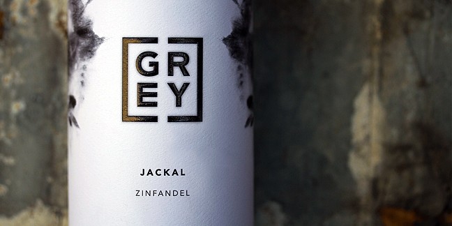
Jones also bottles wine, and his more upscale brand is Cane & Fable.
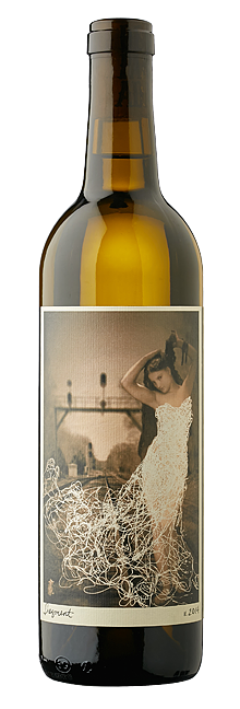
“The labels use old-time engravings from scientific illustrations,” Berger explained. “The 2012 cabernet sauvignon was the first of the brand and has an image of a grasshopper, which can make people feel a little uncomfortable.”
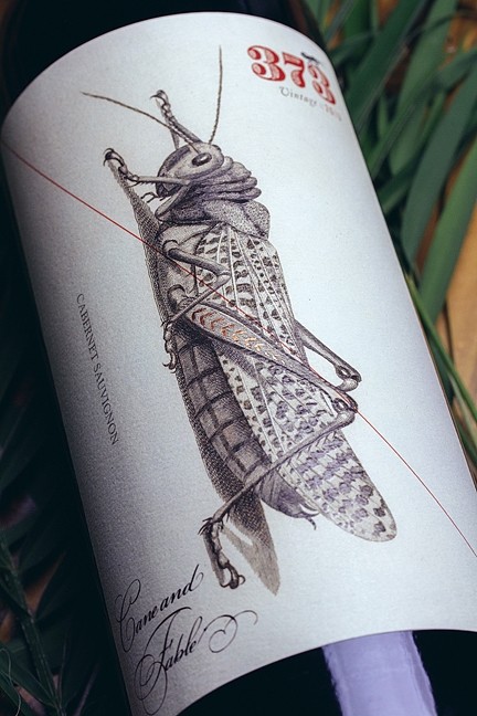
This element of surprise—a large insect on a wine label—is why Makers & Allies has earned a reputation for being fresh and innovative. For the three Cane & Fable wines so far released, Berger took public domain images, then deconstructed and rebuilt them, deciding where to use spot varnish or foil inclusions. In one case, she deconstructed an old illustration of a tree and created a bundle of sticks.
“Each vintage coincides with one of Aesop’s fables,” Berger explains. And while Jones came to the company with the name Alloy for his canned wine, he left up to Makers & Allies the entire branding process for Cane & Fable.
“Andrew came to us and said, ‘We’ve got this cabernet and we want to make a brand,’ so we came up with Cane & Fable, ‘cane’ representing the grape vine and ‘fable’ because every wine tells a story.”
Makers & Allies recently re-branded Baileyana as well, but how do they know if their branding is effective?
“We’ve got really good feedback from the [Baileyana] winery sales staff and distributors, and if the people in charge of selling the wine are excited about the label, that’s a good indication we’re on the right track,” Berger said. “I think [another] good gauge is how is it selling? For Cane & Fable, the first vintage sold out in 2 1/2 months. They started with 1,500 cases. The next year they bottled 5,000, and this year they’re bottling 10,000 cases. That seems like a success.”
Do all wineries seek out firms like Makers & Allies?
“It depends on if they understand the value of design,” Berger said. “Some understand, others understand but don’t want to spend the money, and some see more value in their winemaking equipment, but if you put all this time and effort into making a great wine, you’d hope you’d be willing to spend time and effort into developing brand recognition and create that consistency.”
Of course, Makers & Allies isn’t all about the flash.
“I think there’s a lot to be said for simplicity and elegance and not trying too hard to be edgy,” Berger said. “You want whatever’s outside the bottle to do justice to the creation that’s inside the bottle.”
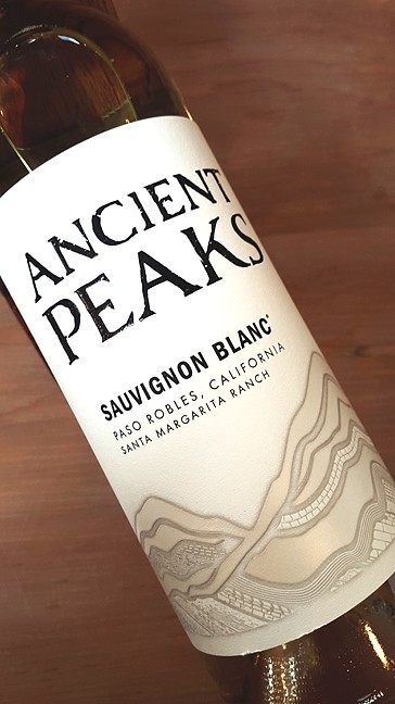
A look at their label for Grey Wolf is a perfect example, as is their Ancient Peaks label.
“Ancient Peaks bases a lot of their wines on their soils, so we wanted to reflect that in the label,” Berger said.
Do it yourself
Some wineries employ their own in-house designer, which is the case for Herman Story Winery and its designer and idea man Philip Muzzy, who, unlike Berger, came into the world of wine branding not from a design perspective but from a wine perspective.

He said he was a “glorified tasting room attendant” who didn’t go to school for graphic design but instead studied acoustic design, which “has nothing to do with this [wine label design].” His education into branding and wine label design came from “a lot of talking and listening.”
“I worked as a wine buyer for a restaurant and wine shop” and was familiar with “selling stuff to people. It’s about storytelling,” Muzzy said.
Herman Story
Herman Story Winery is helmed by winemaker Russell From, who named his winery after his grandfather.
“A lot of Russell’s great life lessons came from his grandfather,” Muzzy explained, adding that the winery started in 2001 and has steadily grown over the years.
Its wine labels feature bold close-ups of common sights—an asphalt road, old barn wood, a worn pair of jeans.
“For Herman Story, we wanted something iconic but worn,” Muzzy said. “Everything’s really bright and bold. The reason we wanted the close-ups is to reveal the unexpected, to pop with color. Russell’s wine is bold and hedonistic but still nuanced and balanced, so the labels suggest a surprising reveal.”
Desperada
For Muzzy, marketing and branding wine is unlike other commodities.
“Wine is an interesting product because it’s mired in history and tradition and occupies a unique place within people’s minds,” he said. “Who’s making this and why? Who is it for and who cares? What’s the story that ties it all together?”
Those are the questions a wine label should answer. Another label Muzzy works with is Desperada made by winemaker Vailia Esh.
“Desperada is a good example. She’s continuously adding new wines, so one thing we try to do is figure out how it fits into the pantheon of Desperada wines and how can we differentiate it from everything that already exists,” Muzzy said. “Vailia is kind of an explorer by nature and grew up all over, and her wines reflect that restless spirit that’s looking for a home. She treats her winery like a living laboratory, and each vintage brings in new wines, new ideas, and new permutations. She makes truly beautiful and inspired wines.
“Her Sackcloth and Ashes is a red blend and it changes each year. We called it Sackcloth and Ashes because that’s the biblical garb of mourning, and all the female figures on the labels are from 19th century French academic paintings, different versions of Venus or Diana.”
These are all public domain images Muzzy discovered and modified for use.
“There’s a fragmented element to the images that reflects Vailia’s process,” Muzzy continued. “Her sauvignon blanc, for instance, is fermented in three different styles and blended, and we wanted to communicate the feminine spirit behind the wines. That’s part of her identity, obviously. She also wanted her labels to reflect the muse-like character of her wines, and I like the ghostly feeling of the images, like they don’t quite belong in the landscape they’re in, like spirits far off and faint, something you can’t quite get a hold of. Hers is a wine of inspiration over style.”
Lost Blues
You can certainly understand the storytelling aspect of Muzzy’s design style. He wants the labels to communicate important elements of the winemaker behind them.
“The Lost Blues brand, which is made by Herman Story’s assistant winemaker Giovanni Grandinetti, is a good example,” Muzzy said. “Gio has kind of a unique story. He grew up here, and he’s the kind of guy who works quietly and dedicatedly. He’s a very inspired person but not flashy—calm and compassionate and rather old fashioned in a lot of ways. So we have this product and want to get it to market. How do we communicate who Gio is? We can’t count on name recognition. Giovanni Grandinetti Cellars doesn’t mean anything to anyone. It’s not like he’s Robert Mondavi, whose name is synonymous with Napa Valley wines and whose family has been killing it for decades in the wine industry. It comes down to distilling the essence of a person.”
Muzzy created an image rendered in a vintage style with a workman toiling away in the background behind a “V” in the label. It’s simple black and white, and the ink is made to look like it bleeds a little, like “an old handmade stamp.”
“We wanted something that felt hand-wrought, thoughtful, that carried a certain history to it, but something a little unique—no shock, no awe, no explosions—so the inspiration came from him being the silent guy, the behind-the-scenes guy,” Muzzy explained. “He’s born and raised in the area, and the place has sort of grown up around him, but he’s sort of a lost tradition in this new and growing winemakers’ landscape, so we though ‘Lost Blues,’ giving a nod to the old ways of doing things. The label suggests respect for the slower ways, respect of the workman, [respect] of history, and he’s carrying on the torch. Newer winemakers have come from elsewhere and sprung up around him, but he’s the constant.”
Lost Blues will sell for about $50 a bottle, which lands Grandinetti’s creation “well into the super ultra premium category,” Muzzy said. “We’re not going for sexy or dangerous—that would be really exciting, too—but it’s a completely different beast. It’s a heritage product, artisanal, traditional.”
Some may wonder how you can go into Trader Joe’s and buy a bottle of Charles Shaw wine for about $2, while other brands sell for 25 times that.
Muzzy explains that when you get into the upper price ranges, the winemaker is paying for premium fruit. If you’re aging in a French oak barrel, a new one costs about $1,000, which holds 25 cases. But a considerable amount of the cost is also associated with the bottle, cork, and labeling. A single premium glass bottle might cost $4, a quality cork $1.50, and a label as much as $2.50.

And then there’re the designers behind the label, people with the skill, talent, and storytelling ability to translate what the wine is all about, and they do it in the space of about 3 by 4 inches, and they know they’ve got your attention for about a second. They make it count.
Glen Starkey is a New Times staff writer. Contact him at [email protected].

Latest in News
-

Access to education: FAFSA's new application process was supposed to make it easier for students to apply for help with college tuition, but it did the opposite for some
Apr 18, 2024 -

San Luis Coastal will begin offering ethnic studies classes next fall
Apr 18, 2024 -
A dispute over a Cambria CSD well on school district property leads to eminent domain threat
Apr 18, 2024 - More »
Readers also liked…
-
Coast Unified teachers upset over new position's salary and qualifications
Oct 20, 2022 -
SLO police identify alleged driver who hit and killed couple
Dec 22, 2022 -
When the levee breaks: Oceano residents, county officials walk a tightrope of regulations to manage Arroyo Grande Creek, which some say led to the levee's failure in January
May 18, 2023
More by Glen Starkey
-

Canadian singer-songwriter Bruce Cockburn plays Cuesta College on April 24
Apr 18, 2024 -

3 Body Problem
Apr 18, 2024 -
Lawmen: Bass Reeves
Apr 18, 2024 - More »
