
Saying it loud
Whether with ballpoint pen, sugar, or faux fur, Marian Bantjes gets her message across
By Ashley Schwellenbach[{
"name": "Ad - Medium Rectangle CC01 - 300x250",
"id": "AdMediumRectangleCC01300x250",
"class": "inlineCenter",
"insertPoint": "8",
"component": "2963441",
"requiredCountToDisplay": "12"
},{
"name": "Ad - Medium Rectangle LC01 - 300x250",
"id": "AdMediumRectangleCC01300x250",
"class": "inlineCenter",
"insertPoint": "18",
"component": "2963441",
"requiredCountToDisplay": "22"
},{
"name": "Ad - Medium Rectangle LC09 - 300x250",
"id": "AdMediumRectangleLC09300x250",
"class": "inlineCenter",
"insertPoint": "28",
"component": "3252660",
"requiredCountToDisplay": "32"
}]

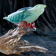
You might call Marian Bantjes a graphic designer; or an illustrator, typographer, painter, or writer. Or you could simply save your breath and call her an artist. The Canadian is so prolific that it would be easier to define her by compiling a list of the few creative avenues she hasn’t explored and the materials that she hasn’t used. But the list would no sooner be complete than she would begin a project composed from algae or sidewalk chalk. Her website is a testament to her boundless creativity, and a treasure trove of types, colors, words, and flourishes. No two projects are the same. She simply doesn’t cater to clients who want to confine her imagination.
Then there are her personal projects, like the tribute to Halloween she delivered to clients and friends in 2005. A tangle of black lines mingle, somewhat menacing; and gathered at the center, like script on a tombstone, are her childhood recollections of the hallowed and candy-crazed spectacle. “When I was a kid, on Halloween we roamed the streets in small packs, emerging out of the night, frightened and exhilarated to be out alone after dark,” begins the piece. But, as unlikely as it may sound for a self-described impatient artist who titled one section of her website “dumb questions,” Bantjes has adopted the most saccharine and sentimental of holidays for her own: Each year she mails out individualized valentines to some 150 friends and acquaintances, assuming the costs for the endeavor and reveling in the freedom of her expression.

“I had this kind of epiphany when I was flying into New York. I was literally on the plane coming down and it suddenly popped into my head, this idea that everything I do I do for love,” she said, explaining her non-commercial work. “And that seemed to be really true. I think it was around that time that I decided that I should send out valentines. There was a practical reason as well in that everybody sends things out at Christmas and everybody gets things and it all sort of gets lost in the rush. I wanted to send something out at a different time of year so it would be more noticed.
“And also Valentine’s Day is such a weird time. It’s like this big romance time and there’s this whole stigma of ‘I’ve never gotten a valentine’ or ‘nobody loves me.’ I just thought it would be nice for people to get something at this time of year.”
Bantjes doesn’t submit her work for design competitions, but others do on her behalf, and often she wins. Time Magazine selected a cover that she drew for Los Angeles (a magazine) as one of The Top 10 Magazine Covers of 2008.

The intrepid designer has been doing whatever it is that she does for about five and a half years, employing pencils, computers, ballpoint pens, cameras, pencil crayons, fine pens, paint, paper, fabric, ribbons, beads, and sugar in her creative arsenal. She is fond of saying that any happening, topic, or discussion is ripe with the incentive to create. Flowered wallpaper patterns, medieval manuscripts, Islamic art, modernism, Swiss typography, psychedelia, Balinese Hinduism, Indian saris, and shiny things in general grapple and stew within her imagination, sometimes culminating in concrete ideas and projects. Bantjes is never without inspiration.
A gallery is just about the only space in which Bantjes’ work has not yet appeared—an oversight the Cal Poly University Art Gallery will remedy between Jan. 9 and Feb. 20. A retrospective of more than 100 of her projects— displayed in video, posters, photographs, and paintings—will accompany a single poster she designed specifically for the show, Marian Bantjes Shows Off.
Other curators have approached Bantjes with an interest in exhibiting her work, but the intractable designer confounded them all by saying no, sometimes because she didn’t like the space, sometimes because the gallery demanded entirely new work. But when curator Jeff VanKleeck contacted her, she felt like saying yes.
“It did seem a little odd because I don’t have any association at all with Cal Poly. I’ve never even been there,” Bantjes admitted. “But it looked like a nice little space.”

While she’s critical of the idea that an image and witty tagline add up to good design, Bantjes emphasizes the importance of good writing. She considers it so important that she insists she can’t think of any great graphic designer who doesn’t write as well.
“Writing is communication, and graphic designers are in the communication business, so I think writing is critical,” she said. “And it’s really good training in logical thought processes. There are so many designers that aren’t logical, and I don’t know how they can even function without being logical.”
That’s not to suggest that text takes precedence over more visual elements of her work; Bantjes is, after all, a designer who considers writing an integral skill, rather than vice versa. Her writing is almost always poignant and often intensely personal, revealing anecdotes and details about relationships. She created a series for Creative Review titled Love Stories, explaining her relationships with the people she loves, from her mother, to her best friend Gillian, to her “real, borrow-a-cup-of-sugar, drop-over-for-dinner neighbors” who she conspires to keep nearby. One valentine is dedicated to, and written on, cake. And there’s a brazen quality to a burned wood dedication to “ALL THE BOYS WHO LOVED ME BACK.”

In the future, Bantjes’ work will likely become increasingly structured and grid-like, reflecting her recent resistance to a more free-form style. But that won’t inhibit the exuberant quality that makes each new piece a surprise, and the very existence of this nebulous art form a discovery on par with that of a new continent. ∆
Arts Editor Ashley Schwellenbach feels like she just discovered a new planet. Tell her how to become a sort-of graphic designer at [email protected].

Latest in Arts
-
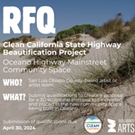
SLO County Arts Council seeks artist or artist team for Oceano sculpture project
Apr 18, 2024 -
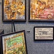
Just Looking Gallery is celebrating its birthday and its ability to bring art to SLO for the last 40 years
Apr 18, 2024 -
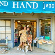
Paso Robles' Spare Time Books celebrates one-year anniversary since ownership shift
Apr 18, 2024 - More »
Readers also liked…

More by Ashley Schwellenbach
© 2024
New Times San Luis Obispo
